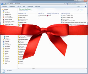
 Many of you may have seen that news about Windows 8 has finally started to circulate.
Actual news this time, not just rumors. I had already expected to read things about Microsoft trying to compete with Apple, saying goodbye to the Start button we’ve all come to know and love and replacing the desktop with a more mobile feel. Even news of a Windows App Store isn’t shocking.
What I wasn’t expecting—and now looking back don’t know why I didn’t see it coming—was the ribbon.
It took me years to accept the ribbon after it showed up in Office 2007. So long in fact I waited until Office 2010 to make the plunge. I don’t use Word or PowerPoint as much as some of you do, but thanks to the ribbon I probably have used those less than I should. Now the ribbon will be part of my every day computing in the new Windows Explorer.
This means reduced screen real-estate and a whack load of options, all with big colorful icons. I like pretty icons, but not when they take up a good chunk of my screen real estate. Microsoft’s rationale is that the average screen resolution is much higher these days than it used to be. Gone are the 800×600 days and now the majority of Windows 7 users are set at 1366×768. Not too bad, but I’d still rather see all of my files.
Plus, if Windows 8 goes all mobile, that would indicate touch-screen compatibility. The ribbon is going to be touch friendly? I’ll believe it when I see it. Maybe I’ll wait until Windows 9 to upgrade.
What do you think of the ribbon? Love it? Hate it?


